Kenyon Identity Extensions
Branding, Logo design
As a design lead in the extension of Kenyon’s visual identity, I have created many marks for Kenyon events, fundraising efforts, programs, and video series for audiences ranging from 17-yr old perspective students to alumni from a time before women were permitted to enroll at the college. A unique challenge in this effort is creating a mark that appeases a desire in college colleagues to depict the distinctiveness of their initiative while ensuring that said mark accurately feels like a part of Kenyon’s identity system. The intention behind these logos is that they live beyond just a mark and feel more like sub-identities with lives of their own so that colleagues across the college feel empowered to incorporate the Kenyon brand into their own work.

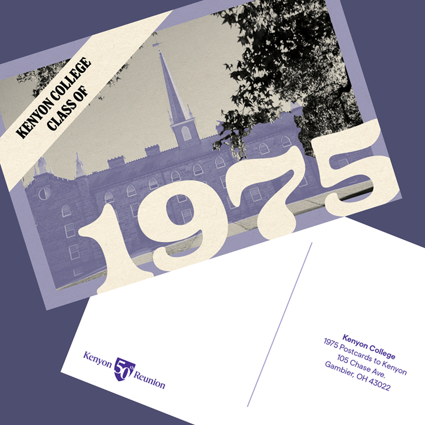
KENYON REUNION — This mark was designed with the intention of being evergreen with an updatable year element. The shield outline echoes the college’s official shield, a timeless symbol that holds familiarity across generations of alumni.
43022 DAY —To commemorate a quirky date that coincided with Kenyon’s zip code, the college planned a day of festivities on April 30, 2022 in collaboration with the city of Gambier — the town Kenyon calls home. I designed a logo inspired by vintage postmarks with an approachable seal-like shape that made the mark easily applicable across event materials and corresponding fundraising appeals.
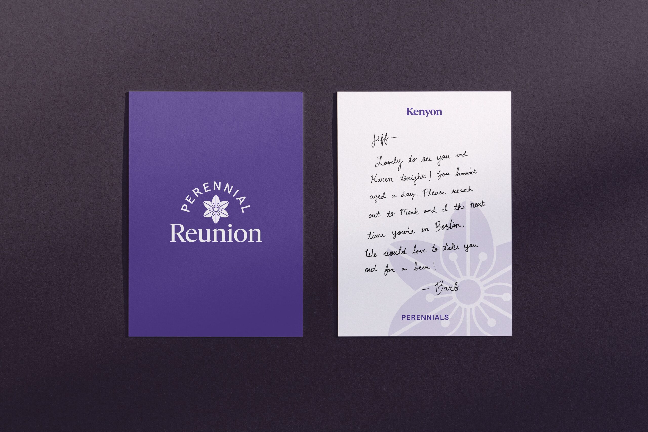
PERENNIAL REUNION — Perennial Reunion encompasses every class that has surpassed 50 years since graduating from Kenyon — and that’s worth celebrating! To commemorate this special group of alums as well as indicate their Reunion-related programming accordingly, I designed a mark that is both rooted in the college-wide Reunion brand and offers a unique visual in that of an asphodel bloom. The asphodel has symbolic meaning that is unique to Kenyon alumni, as it is referenced in one of the college’s official songs every student must learn, “Kokosing Farewell.”
KENYON KRIBS — Kenyon Kribs is exactly what it sounds like: a casual, MTV-esque, dorm tour series. Knowing that the primary audience is 17-18 year olds looking up Kenyon housing options on Youtube, I decided to give an unconventional and energetic approach to the series’ logo that is designed using one of Kenyon’s more unique secondary brand fonts, Spezia Sans.
ROLE
Design
COLLABORATORS
Adam Gilson — design direction
Want to chat?
Find me on: